TransUnion
Rebrand
Rebrand
In our strategic process, TransUnion had come to “see the people behind the numbers,” transforming from a traditional credit bureau into a provider of “Information for good.” Accordingly, we strove for design that reveals the people, the humanity, behind the logo.
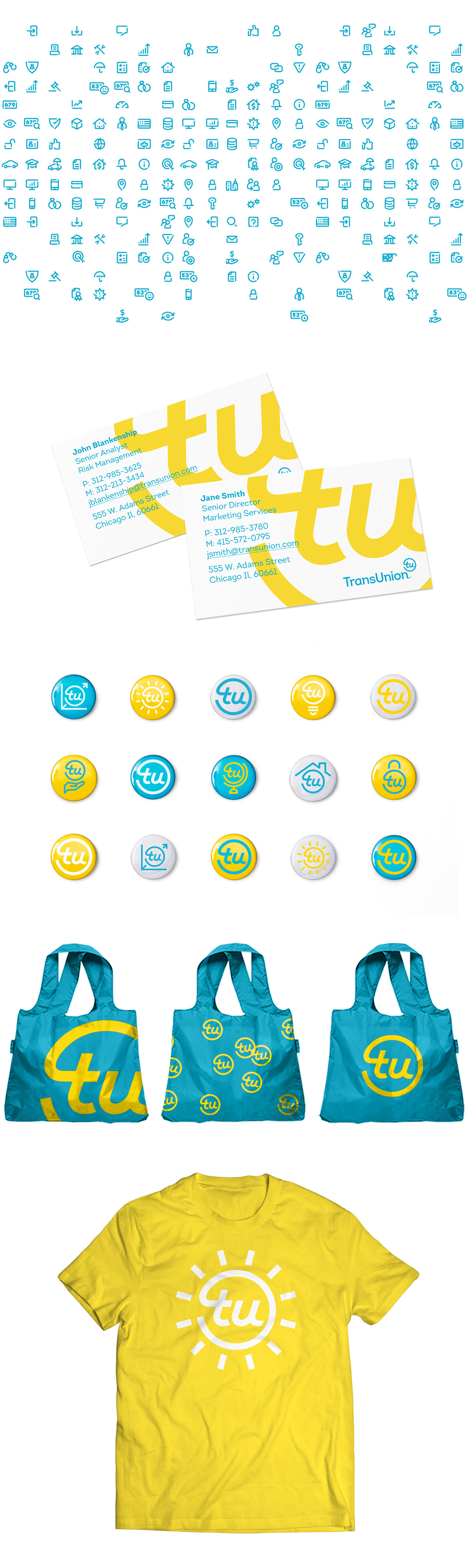
As we said on the client’s behalf in the brand guidelines: “Our logo communicates our friendly nature. It’s designed to be minimalist and avoids abstract symbols. Though it’s simple, its curved letters keep us approachable. Our logo reflects who we are–honest, tangible, accessible.”
As we said on the client’s behalf in the brand guidelines: “Our logo communicates our friendly nature. It’s designed to be minimalist and avoids abstract symbols. Though it’s simple, its curved letters keep us approachable. Our logo reflects who we are–honest, tangible, accessible.”
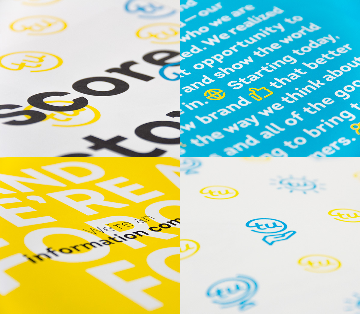
The human side of this global firm was also emphasized in photography, featuring the end-user, and in the brand voice, which emphasized jargon-free language, all to let the brand’s personality shine through.